March 2013 vs. March 2012 had two fewer (10%) business days due to both Easter falling in March this year and how March weekends fell, so the 9% decrease in trip count can be explained due to the fewer business days.
However, the revenue fell 13% which reflects a softening in the market year-over-year. It is important to note that March 2012 was a huge month last year, so it would have been great to match the strong performance of March 2012 in March 2013. Of more concern is the continuing softness in the rate per mile. We have heard of companies in the network who have chosen to cut rates to improve business volumes. No comment.
The March 2013 vs. February 2013 had the same number of business days, so the increase in business (month to month) is due to seasonality more than anything. March tends to be a stronger month (even compared with April) simply because it is an “end of quarter”. Again we are seeing a softness in the rate-per-mile and we are tracking 2011 numbers and below 2012 numbers in terms of rate/mile. The charts and graphs below clearly show this “flattening” trend.
Capacity is continues to lag and has still not reached 2007 levels. It is odd that the major US stock markets are reacting so strongly while “transportation demand” seems to be relatively flat. Transportation is often considered a “leading indicator” so the strength in the Dow is somewhat puzzling.
Here are the metrics in a table format:

Breakout of Revenue by Revenue Type:
In the above table, we show changes in TOTAL revenue and then the changes in the components of total revenue (line-haul, fuel and accessorial). Here is the breakout by percentage of Total Revenue.
- Line-haul revenue represents 75.5% of the total revenue
- Fuel revenue represents 12.6% of the total revenue
- Accessorial revenue represents 11.9% of the total revenue.
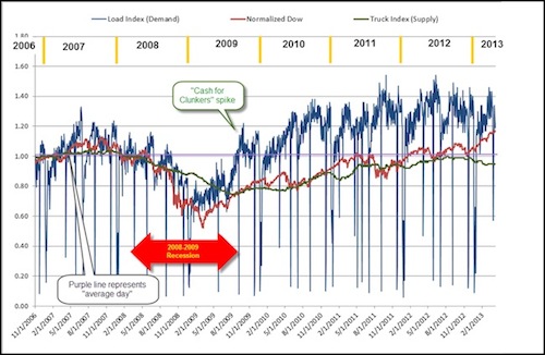
Supply/Demand analysis
2011 was the best year ever for many Sylectus customers. 2012 started out ahead of 2011, but the last 6 months of 2011 tracked with 2012. The first few months of 2013 are tracking closely with 2012. We see a particularly strong increase in our long-term customer base (customers with us for at least 5 years). The long-term customers have such a strong, well-established, trusted network within the Sylectus Alliance, that they have been able to leverage the Alliance capacity into higher business volumes.
Our SUPPLY-DEMAND index (below) is comprised of a subset of our customers that have been on our system for a minimum of 6 years.
The BLUE line is the normalized load count (DEMAND) and the GREEN line is the normalized fleet count (SUPPLY) for the companies in the index. The RED line is the DOW JONES INDEX normalized the same way as the DEMAND and SUPPLY chart.
Capacity is going back down. We noticed that capacity almost reached 2007 levels but has slowly retracted over the past few months. A lower capacity number will push rates higher.
In contrast, the Dow Jones is now above the 2007 highs.

What is driving this success of our customers is not a strong, rebounding economy, but rather a continued and prolonged shortage of capacity. We are beginning to see an equilibrium reached between supply and demand which is stabilizing rates.
Chart Analysis:
If you look at the table below … you will see that Line-haul revenue per mile in 2008 was in the $1.50 to $1.60 per mile. In 2009 the Line-haul revenue per mile has slipped as low as $1.25 before rebounding to the mid $1.40 range. 2011 rebounded and ended the year nicely, and 2012 has continued the good rate structures of 2011, even surpassing the 2008 high months that were affected by the high price of fuel. However, over the past few months, we have seen an erosion of the line-haul rate/mile.
At the “total revenue per mile”, 2013 is tracking 2012. However, the “line-haul rate per mile” is lower than 2012 and more in line with 2011.
The following data / chart shows 2005, 2006, 2007, 2008, 2009, 2010, 2011, 2012 and 2013 in terms of total revenue per mile, line-haul revenue per mile, accessorial revenue per mile and fuel revenue per mile.
Total revenue per mile is a combination of
- Line-haul revenue per mile,
- Accessorial revenue per mile and
- Fuel revenue per mile.

The four charts below show Revenue per Mile for the past 8 years. We the show 4 charts of:
- Total Revenue per mile (numbers include line haul, accessorial and fuel)
- Just “Line haul” revenue per mile (rates have been relatively stable since June 2011).
- Just Fuel revenue per mile (rates have stabilized since the 2008 fuel spike, but are starting to rise now).
- Just Accessorial revenue per mile.


Sylectus created a graph to try and compare how the “Load Index” (Demand) and “Truck Count Index” (Supply) compares with the “Dow Jones Index”.
The “Load Index” (Demand) is the combined load counts of a subset of our customers normalized to an index value. A value of 1.0 is normal. A value of 1.2 is 20% above normal. A value of 80 is 20% below normal. We started recording the index on December 1, 2006, so we have over 6 years of data in the index now.
The “Truck Index” (Supply) is the combined fleet counts of a subset of the same “load index” customers normalized to an index value. A value of 1.0 is normal. A value of 1.2 is 20% above normal. A value of 80 is 20% below normal. We started recording the index on December 1, 2006, so we have over 6 years of data in the index now.
We took the closing value of the Dow Jones Industrial Average (DJIA) and used the same process to normalize the data (we did this by using the same “measurement period” for calculating the normalization value). Just like the “Load Index” and “Truck Index”, the “normalized DJIA” will have a value of 1.0 being normal and value of 1.2 is 20% above normal (etc.).
Below you will find the two normalized indexes charted from December 1, 2006 through to current date. The BLUE LINE is the “Load Index” (Demand), the GREEN LINE is the “Truck Index” (Supply) and the RED LINE is the “normalized DJIA”

Sources:
- “Sylectus Index” – Summary of data from Sylectus companies.
- “Dow Jones Industrial Average” – Yahoo database of Dow Jones closing values
So what does this chart tell us?
- Supply of trucks (capacity) continues to lag below demand and was slowly recovering but has reversed that trend. It is back down below pre-recession levels.
- The Demand (loads) chart is tracking better than 2007. 2010 and 2011 were great rides. 2012 started out ahead of the same period last year, but the last 6 months of 2012 tracked 2011. 2013 is tracking slightly ahead of 2012.
- Although both graphs tend to TREND in tandem, the DJIA tends to be lower than the Load Index for most data points but tracks the capacity graph very closely until recently.
About Sylectus
Sylectus is trucking’s most powerful network. Born in the new, cloud-based economy, it’s built on one simple idea … leverage the resources of your competitors to achieve extraordinary results for your customers and for your company. Sylectus is more than Transportation Management Software. It’s a web-based, protected, wealth creation network for managing in the New Trucking Economy. Designed exclusively forprogressive trucking companies, Sylectus enables them to bypass the investment and time continuum to grow fast NOW.